Even with the most ideal choice of a house or apartment from an architectural and design point of view, there is always some imbalance in proportions. Each of us wants to make the atmosphere of the home not just harmonious, but to bring some zest, refinement to it.

There are several design techniques that help to refine the space, add personality to the interior, give it a special character.
The basic principle of these little tricks is the contrast of the color and texture of the materials.
Expanse - a game of contrasts
Even in the smallest room you can, and even need to create the illusion of space. Visual space is achieved by combining contrasting shades: light and dark, cold and warm. Light, even pale walls, due to their apparent lightness, will optically expand the room, the “cold” decor - light green, purple, blue, visually move the walls and raise the ceilings.
Intimate notes - a synonym for comfort
Dark soft tones, although they hide the space, give the atmosphere a feeling of comfort, a certain intimacy, “warm” the room. Especially good in this regard are all shades of brown and red. For the greatest effect, contrast is important - light and dark tones of the same color scheme.

Ceilings usually create only two problems - they are either too high or too low. In the first case, the ceiling needs to be decorated with a warmer and darker shade than the color of the walls, however, the paint tone should not be very saturated, otherwise the ceiling will be “heavy”.
To visually raise the ceiling, it is decorated in the same color scheme as the walls, but with colder, more saturated colors.
The distinctive character and sophistication of any interior gives the various components of architecture - stucco, railings, borders, battens, frames. Small details, such as stucco molding in the interior, have a very positive effect on the visual perception of the room, they seem to “finish” the decor, serve as its final touch. As a rule, such components are distinguished by lighter tones compared to the main palette of the decor, cover them with gloss. In rooms with a small area, the use of a large number of architectural elements is not welcome. And those details that are nevertheless provided for by the interior style should not be highlighted in color, in this case, the contrast is inappropriate. Otherwise, concealing and making the space heavier, they will cause irritation.
Divide the space into zones

This is one of the most fashionable techniques of modern designers. Moreover, the space is shared not with the help of furniture, but with the participation of contrasting shades. Using dark and light tones of one scale, the room can visually separate the bedroom area from the boudoir zone or reading corner.
When there is no confined space
Today, studio apartments are very popular. In the design of such a room there are practically no closed doors and enclosed spaces. The division into zones in such a dwelling occurs due to the extreme contrasting of the shades of one color. In addition to competent decor in such spaces, it is very important to carefully consider the layout that is in harmony with the palette of the apartment. Designers call this technique nuance - that is, emphasis on trifles, some chips using a game of color and zoning
1. The unity of all elements of the interior
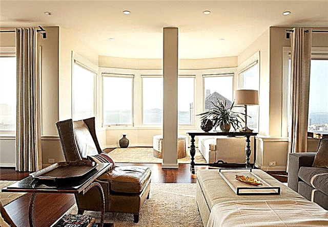
The harmonious design of the apartment involves the generalization of all objects that perform their functions, and at the same time are an integral part of the overall interior. For example, if when creating a design preference is given to bright, rich colors, you can balance the interior when using simple forms. That is, each element in the room should be perceived as a piece of the general style, it should not give the impression that a certain detail exists on its own. This is especially true for the construction of partitions, arches.
If the room is small, and there is large furniture or appliances, which can not be done without, you can balance the interior by using light colors, reflective surfaces or additional lighting fixtures. It is also important to evenly distribute large elements in the room. The cluttered one part of the room and the emptiness in the other part make the overall interior disharmonious.
2. The right color scheme
Often mistakes are made when choosing a color scheme. Complex color combinations are not recommended. The most optimal solution is the use of no more than three colors when creating a harmonious interior. To choose the most suitable options, it is recommended to use the color wheel, which easily allows you to choose the gamut for the design of any room.
3. Several styles can also look harmonious
A major role in creating a harmonious design is played by the correspondence of all elements in the room to a single style. A room in which there is one style looks much more harmonious. Recently, however, the use of several styles in the design of premises has become popular. At the same time, it is important to harmoniously combine all the details so that none of them stand out. This is a rather complicated job, and only a specialist can handle it.
4. Lines in the interior - play a role
When choosing an interior with a predominance of straight lines, it is important to maintain their style unity. If the lines are used incorrectly, they can make the room rough. As for the smooth lines, they can soften the general perception of the interior of the room, make it more fluid, but an excessively large number of curved lines deprives the room of harmony, making it tense.
If you summarize the advice of designers, they recommend: when creating a room design, it is important to pay attention to the color scheme, the distribution of large and small elements in space, on lines and shapes. And in the end we get a place where you always want to return.
Natural colors and natural materials
The color of the Japanese home is always determined by the environment. Plant tones are dictated by nature itself: beige and brown shades resemble the earth, the whole palette of green is vegetation. And to a natural tree you can add accents made of stone and other rocks.
In the West, vertical landscaping has become popular in interiors, and in the East, one of the main trends is freestanding or built-in vertical fountains. If you are not ready for a wall waterfall, then start with art depicting water.
And don't forget about the bathroom! In Japan, the word ofuro is translated as "relaxing bath procedure." In the realities of residential premises this translates as short and deep sitting bathtubs or barrels. Their size is adapted to a modest footage.
Sliding doors
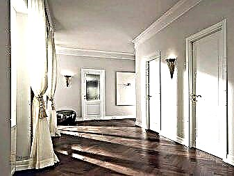
Usually apartments in Japan are small in size, each centimeter of space is counted, so ordinary swing doors are replaced with sliding doors. Traditional Japanese sliding doors are made of thin paper fixed inside a wooden frame. In today's world, glass replaces paper. Such doors save space, do not interfere with the penetration of daylight and open a view of nature, unity with which is so important in the Japanese interior.
Subtleties of arranging a harmonious interior:
1. Competent choice of color scheme.
An interior in any color can look harmonious and interesting - this is a fact that can not be doubted. But the creation of the wrong color scheme can introduce chaos and a sense of imbalance into the design. At the moment, there are four color combinations in the interior, adhering to which it is quite possible to achieve harmony. More information about each of them can be found at http://tadgikov.net/vse-pro-otdelku/1404-tsvetovye-kombinatsii-v-interere.html. It is also worth remembering that in one room you cannot use more than 5 different colors.
2. The choice of a single style for the home.
Some believe that the design of different rooms in different styles will make their home more interesting and unique. Of course, the exclusivity of such a design is beyond doubt, but this exotic will quickly begin to annoy, especially if the directions are diametrically opposed. In extreme cases, you can use several related styles that have common features and a similar color scheme. For example, the bedroom can be maintained in the style of "Provence", and the kitchen in a kindred Mediterranean direction. Agree that the high-tech living room next to the Chalet kitchen will look at least strange.
3. The use of common parts.
Repeating elements in each room will help to make the interior of the home holistic. It can be any original borders, niches, stucco decoration and much more. The main thing is to unobtrusively emphasize the commonality of the interior. At the same time, you should not focus on too many details, 1-2 elements will be quite enough. Otherwise, the design will look just tasteless.
4. The right selection of furniture.
The presence of completely different furniture in the rooms will definitely not contribute to the harmonization of the interior. In all items used should slip common notes. For example, all models can be made from one type of wood or processed with one shade of varnish. You can also create the integrity of the image with the help of upholstery, so the same upholstery fabric on a sofa in the hall and chairs in the kitchen will look very interesting and harmonious. Unity can also be achieved using textiles with a single pattern, for example, on curtains. Moreover, the material does not have to be the same, the main thing is the similarity of the print.
A harmonious interior will help not only to make the home beautiful and stylish, but also beneficially affect the psychological state of all its inhabitants, surrounding them with an aura of peace and tranquility.
Harmonious Interior: Professional Tips
 "My most important rule: always ask yourself" why? " regarding every detail. Any part must bear a certain load, aesthetic or functional. The main thing is harmony, remember this. If this element carries simply an aesthetic meaning, it should be combined with the general mood of the interior, or on the contrary stand out from the general background. But there cannot be many such elements - this is important! ”
1. Working on the layout:
- Refuse complex forms. Waves, zigzags, semicircles - in the past. Choose clear geometry, strict lines - circle, square, rectangle.
- Try to maintain the maximum ceiling height. Three rows of drywall boxes clutter up the space.

- Think storage systems. Strive to hide everything as much as possible - this will create a feeling of cleanliness. Shelves, racks and cabinets can be built-in. You can leave open a couple of shelves for decor. Do not forget to think about a place to store household cleaning products, a vacuum cleaner, buckets, dirty laundry and so on.
- Plan your lighting. Make several levels of light - the ceiling, sconces, floor lamps, you can also highlight something from below - it usually looks spectacular on textured walls, such as brick. Forget about the multi-colored LED backlight and use dimmers - this is very convenient. Consider the location of the passage switches: it is very convenient to turn off the light while lying in bed. Do not forget about the sockets, which, as you know, there are not many.

- Do not clutter up the interior. Feel the proportions. Always bet on clean space. A huge chandelier with a low ceiling looks absurd, no matter how beautiful it may be. Always leave large aisles, not less than a meter. Of course, each space is individual, but take care of the "air" in the interior.
2. Choosing finishing materials:
- Do not save on what you have to serve for a long time: floor coverings, tiles, kitchen, plumbing. Everything else can always be repainted or changed.
- Use more natural materials. Wood, cotton, linen, stone - all this creates coziness.

- Do not overdo it with trim. Remember that the main task is to create a harmonious box in which you can continue to play with details, changing your mood. Bet on painting. Think of a few accents - wallpaper, brick, wood, aged wall. Emphasis is a small element on a general neutral background, do not forget about it. This can be one, maximum 2 walls in the room: at the head of the bed in the bedroom, for example, or a TV area in the living room. If the accent is bright in color or texture, then the rest of the walls should be as neutral as possible. The same goes for the sexes.
- Choose 3 primary colors if you want to create a monochrome interior. You can add one accent. My win-win option is gray (several shades are possible) + white + black (minimum) + natural wood (2 close shades are possible). If you want to add an accent color, then in these combinations yellow or turquoise looks very beautiful.

3. Buying furniture and decor:
- Try to combine elements from different styles, just be careful! If you adhere to the rule of the three primary colors, then creating a common harmony will become easier. For example, put 2 chairs of different shapes, but the same color. Remember that there should not be many accent details. For example, in a Scandinavian-style living room, two classic accents are quite enough - chandeliers and paintings or mirrors.

- Leave the choice of such details as curtains, pillows and paintings at the very last moment. When the general picture begins to emerge, it will become clear what is missing.
- Do not be afraid to experiment with the pictures. Bright elements in the style of pop art or objects of modern art often add personality to the space.